Application IA and Navigation Design

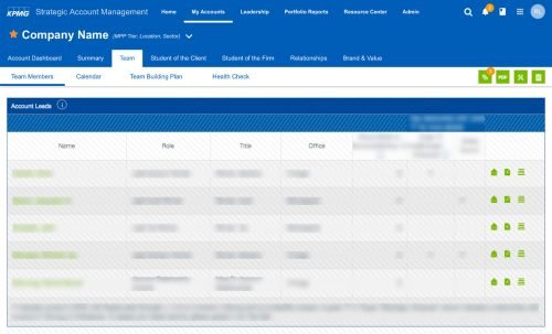
My work encompassed analysis of the current application and suggesting a new information architecture to improve usability. The proposed design included a global application header along with an easily accessible multilevel navigation structure. The new IA was intuitive and provided direct access to important top-level sections at all times, along with easy to follow tabbed navigation for subsections and third-level navigation for content pages.

Along with the structural improvements, I suggested a fresh new look reflecting the recently updated KPMG brand aesthetic.
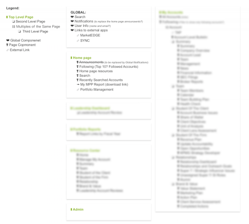
Example of 3 levels of navigation.

A collapsable quick information section is always available for reference at the top of all client’s detail pages.

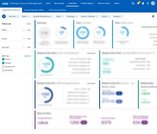
Project previews are intentionally displayed as thumbnails with blurred key information in order to provide some insight into the overall design while protecting confidential information.

Leadership Dashboard

A specialized dashboard to allow leadership to quickly get an up to date overview of all accounts.

The overall new design, as well as the dashboard, is based on the Material Design system as part of a global effort to bring design consistency throughout internal applications.